All Posts in Graphic Design

21st November 2016 - No Comments!

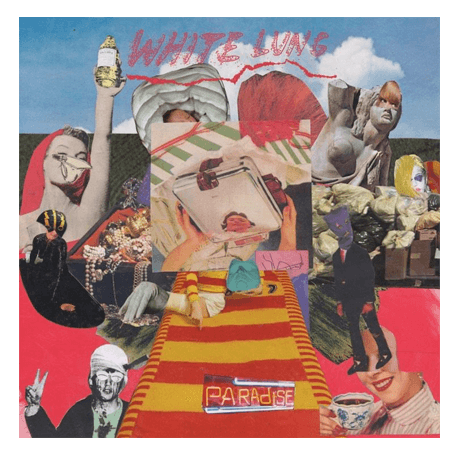
We Got It From Here, Thank You for Your Service by A Tribe Called Quest

They are back! And we needed them!

A dirty artwork as if it was done by a kid that makes me feel that they say thank you to the very organized chaos (that we can call society) and then a kid (let's try millennials here) occupied the scene with a crayon drawing on top assuming its position of consciousness that is much needed. A bit like they did 18 years ago with the hip-hop movement and the world, once again they're back with an epic album that is much needed if we think about how's the world today.

And what we need is what A Tribe Called Quest always gave us: good vibes and PMA. Right now (or ever), I would say that we don't need more gangster rap and white collar gangsters. 2016, a year where love is leaving us and anti-migration politics are becoming stronger in stronger, with this album ATCQ rage against the toxic mentality that is conquering the western world. I grew up with people that say how much they love music but kinda hate philosophy classes. Well, this album is just one more example of how philosophy and music can be just one thing. And how great minds can make us thing through their lyrics. Hit play and let this album repeat and resonate in your mind. It will help you wake up from the numbness the social media brought us into.


31st October 2016 - No Comments!

Herb Lubalin: Typographer

I'm not sure when was the first time that I've heard about Herb Lubalin. I'm positive that it wasn't at Uni because I'm sure that as a type afficionado I wouldn't forget his name. What I do remember is the familiar feeling I had when I first saw his work knowing that he was the responsible for it.

This book is one of the best ways to be familiar with him from a personal to a professional level. Unit Editions did a great work (again) in producing a book that allows more information than what we thought could be available making absolute justice to the content through the way this book was beautifully designed. There are many things to be said about Herb Lubalin, but you will read far more interesting stuff about him than in this post. If this post made you google Herb Lubalin... job done.

Regards to being a great typographer, Herb once said: "I'm terrible because I don't follow the rules". Well, the truth is that his work set a new standard contributed to projects like Gastrotypographicalassemblage.

Please have a look at this book, or at least at his work. Because if I had to pick a favourite, that would be him.

14th October 2016 - No Comments!

Yes Lawd! by NxWorries

After Anderson .Paak released his album Malibu earlier this year, the R&B artist didn’t stop to surprise anybody who felt that this kind of music needed some refreshment and novelty into it. His collaboration with the producer Knxwledge gave birth to this brilliant album.

I guess, there's no need to over explain the artwork, but it's safe to say that looking at an old wall with different layers of paint on top of it can represent that maturity these 2 artists have and how far back they can go to get inspiration from. The X, is already present in Knxwledge, but in this case, can not only represent both artists connection but also a kiss instead of a hug. Which I definitely imagine that being a case when I listen to Livvin or What More Can I Say.

28th August 2016 - No Comments!

Steinweiss: The Inventor of the Modern Cover

As a graphic designer, when looking at record covers is pretty obvious what the word cover means: an artwork that will give you the first hint on what you're about to listen. But obviously, it has never been like that. The vinyl cover was exactly what the word cover means: to protect something against loss, damage or accident.

It was while at Columbia Records in 1938 that Alex Steinweiss, as the art director suggested an artwork for every new music release of the company. They were brave enough to take the risk and give a try at Steinweiss' suggestion leading to an 800% increase in sales in that year.

When looking at older music collections, I can't help but notice, and question myself, why most of the Jazz albums have such a modernist approach where constructivism, Bauhaus or De Stijl influences are inescapable.

Nowadays it seems hard to make a new invention, but there was nothing new about what Steinweiss did back then if you think about a music poster.

They already existed, Steinweiss just asked himself: What if I put a poster on the cover of the vinyl?

In many situations we find ourselves dealing with impossible cases and most of the times we just need to reframe our problem and bring new questions to the table.

With great success and a huge worldwide impact, that was Steinweiss did.

30th June 2016 - No Comments!

Trans Day of Revenge by G.L.O.S.S.

It's an awesome feeling when something as raw as G.L.O.S.S. (an acronym for “Girls Living Outside Society’s Shit") can still freshen up things in the punk-hardcore music.

Powerful lyrics, screaming their heart out with tight riffs and loose guitar solos that remind me the freedom of Black Flag compositions.

The artwork couldn't be more raw. Enough with the old b/w photocopy or the collages inspired by Vivienne Westwood. Punk hardcore explores a lot of doubts, most of them are addressed in our adolescence. Their artwork reminds me the old drawings in the corner of the page of your history school book. It was your inner rebel being expressed with rough words, scribbles and drawings. And for that, I love this album cover. Check them out!

30th June 2016 - No Comments!

What they don’t teach you at Harvard Business School by Mark McCormack

As one of the most powerful man in sport, Mark H. McCormack gives us great insights on people, sales and negotiation and running a business. This book has 3 parts and you will soon realise that you don't have to damage other people's goals to give priority to yours.

Establishing a dialogue, defining milestones and objectives throughout an exercise based on experience and intuition, this book will help you to better understand that make decisions based on your gut is far from being wrong. There's no such thing has a right procedure that you can take and use but there's a way to understand which things are involved in the business world and how can you define your own way of finding solutions and raise the appropriate questions.

What they don't teach you at Harvard Business School is something that you will learn with your life experience and this book will definitely open your eyes on how to manage expectations and be successful in your business.

Hint: Being successful shouldn't be about getting rich, it has a closer relation to what drives you and how helpful your business can be to people. If you do that right and avoid being sloppy with your billing, money will come in.

I understand that if you're a designer is not easy to feel motivated to read this book, but designers are only needed because there are many people who don't design and it's great when you understand how to deal with them and their problems.

Laughter is the most potent, constructive force for diffusing business tension: so be the one who controls it.

30th May 2016 - No Comments!

Paradise by White Lungs

This month was hard to pick. Radiohead just released a new album and probably there’s already way too many people talking about it. That’s why I picked another great album from a lesser known band: White Lung.

With extremely hot and exciting riffs and Mish Way’s unique voice Paradise will definitely give you enough energy to get through those busy days of work.

Their cover is a really clever form of decoupage where the lack of uniformity turns this cover something worth to rediscover every time you listen to them. Working with pop elements that you can easily find in magazines or posters, reassembled in a very D.I.Y. and raw aesthetic, giving you the punk elements that inspired covers like God Save the Queen.

Surely an album to make your blood pumping.

30th May 2016 - No Comments!

Slanted 27 / Portugal

For this month, I'll make an exception in the book section bringing you a very special Slanted Magazine about Portugal.

Slanted is well known for publishing a great body of work on typography and graphic design. In their #27, they interviewed most of the prominent Portuguese designers, type designers, illustrators and design studios. It is great to see so many talented friends in the spotlight through their work and words. But besides work, there were 3 very interesting and insightful articles on Austerity (by Violeta Santos-Moura), the Pioneers of Portuguese Design (by Mac Cormack) and few others that will definitely help to contextualize the Portuguese design scene.
Read more

5th May 2016 - No Comments!

New lettering project: Overblack

In some lettering news, couple weeks ago I've entered in the Magnética Magazine competition: Overblack.

We were meant to explore the importance of the black book in the creative process.
This is an homage to failure, experimentation and doing what you need to do. There are no boundaries or limits in your black book. You're free to do what you want without being afraid of judgemental opinions.
Through photography, I shot a black book and painted it all over with acrylic paint. It was really experimental and the main reason to get in this competition was to be able to do more manual work. Which was great!

30th April 2016 - No Comments!

The Art of War by Sun Tzu


Dating from the 5th century BC, The Art of War is still a reference not only in a war context, but for life in general. As one of the most important books on military strategy and tactics, this book goes beyond war and its strategies and tactics. 13 chapters with rules that you may or may not disagree with, but one thing is for sure: it doesn't matter what you do for a living, this book will guide you to the importance of planning, strategy and context. Read more