All Posts in graphic design

31st October 2016 - No Comments!

Herb Lubalin: Typographer

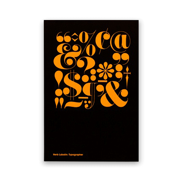
I'm not sure when was the first time that I've heard about Herb Lubalin. I'm positive that it wasn't at Uni because I'm sure that as a type afficionado I wouldn't forget his name. What I do remember is the familiar feeling I had when I first saw his work knowing that he was the responsible for it.

This book is one of the best ways to be familiar with him from a personal to a professional level. Unit Editions did a great work (again) in producing a book that allows more information than what we thought could be available making absolute justice to the content through the way this book was beautifully designed. There are many things to be said about Herb Lubalin, but you will read far more interesting stuff about him than in this post. If this post made you google Herb Lubalin... job done.

Regards to being a great typographer, Herb once said: "I'm terrible because I don't follow the rules". Well, the truth is that his work set a new standard contributed to projects like Gastrotypographicalassemblage.

Please have a look at this book, or at least at his work. Because if I had to pick a favourite, that would be him.

28th August 2016 - No Comments!

Steinweiss: The Inventor of the Modern Cover

As a graphic designer, when looking at record covers is pretty obvious what the word cover means: an artwork that will give you the first hint on what you're about to listen. But obviously, it has never been like that. The vinyl cover was exactly what the word cover means: to protect something against loss, damage or accident.

It was while at Columbia Records in 1938 that Alex Steinweiss, as the art director suggested an artwork for every new music release of the company. They were brave enough to take the risk and give a try at Steinweiss' suggestion leading to an 800% increase in sales in that year.

When looking at older music collections, I can't help but notice, and question myself, why most of the Jazz albums have such a modernist approach where constructivism, Bauhaus or De Stijl influences are inescapable.

Nowadays it seems hard to make a new invention, but there was nothing new about what Steinweiss did back then if you think about a music poster.

They already existed, Steinweiss just asked himself: What if I put a poster on the cover of the vinyl?

In many situations we find ourselves dealing with impossible cases and most of the times we just need to reframe our problem and bring new questions to the table.

With great success and a huge worldwide impact, that was Steinweiss did.

30th May 2016 - No Comments!

Slanted 27 / Portugal

For this month, I'll make an exception in the book section bringing you a very special Slanted Magazine about Portugal.

Slanted is well known for publishing a great body of work on typography and graphic design. In their #27, they interviewed most of the prominent Portuguese designers, type designers, illustrators and design studios. It is great to see so many talented friends in the spotlight through their work and words. But besides work, there were 3 very interesting and insightful articles on Austerity (by Violeta Santos-Moura), the Pioneers of Portuguese Design (by Mac Cormack) and few others that will definitely help to contextualize the Portuguese design scene.
Read more